I wrote JavaDBF library back in 2003 as no Free/Open Source library was available to read/write XBase file formats in Java. That period was the fag end of XBase’s glory days. Many legacy data were available in that format which need to be fetched/migrated/exported to RDBMS-based system or to spreadsheet formats. Since its first version, JavaDBF has been used in a variety of applications ranging from personal projects to business systems to embedded systems. It has been ported to .Net by independent contributors and thus made it available in native Microsoft platform as well. A version that works in Android too is available now. However, one of the applications that fascinated me most was from the agro/farm domain:
We’re using JavaDBF to make it easier to read data coming from certain sensors that are used in tractors. They measure lots of values which can be read as a dbf file that contains those values together with GPS coordinates which we use to project on a map.
When I ran a check on the net recently, I found many “unauthorized” (claiming to be the original version) forks spread across the Web and that too with donation buttons! That’s how Free/Open Source works 🙂
JavaDBF which was released in GNU/LGPL license had been available for download at Sarovar.org ever since. It crossed 50,000 downloads so far and still counting.  Unfortunately, Sarovar.org–India’s first and probably last Free/Open Source hosting website–is shutting down this December 31 (2013). See the details here: http://sarovar.org/forum/forum.php?forum_id=1899 (link will be available till the shutdown).
So JavaDBF that still continues to be popular had to find a new home and it finally moved into Google Code. 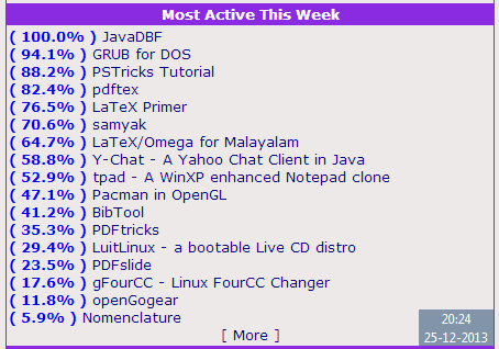 It will be available at the URL: http://code.google.com/p/javadbf/ here onwards. Google Code is no match for Sarovar.org considering the facilities such as project web site, forums and mail lists which were available at Sarovar.org. But I have decided to opt for Google Code instead of other available options.
Indian Free/Open Source history will not be complete without the story of Sarovar.org which was solely funded by River Valley Technologies and maintained by the folks at Linuxense/Mettle Networks for the past 10+ years. Thanks to all those who made it run this far.
Good bye, Sarovar.org!
New link for JavaDBF: http://code.google.com/p/javadbf/